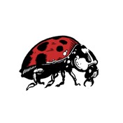
so here is something i finished recently that i was really happy with and felt like it has kind of taken me in a new direction that doesn't involve using as many references and lets me be a little more creative with how i compose the image. i guess there wasn't a huge concept behind this image other than the fact that i just wanted to make something that i found pleasing to look at. as another bonus i also had a go at screen printing these and they came out quite nice considering it was my first time. i've also included the original artwork because usually i would draw the elements of the image seperately and then compose it on photoshop but i've started to lean towards drawing the whole image as one which i think ties the whole image together alot better.

Saturday, 6 February 2010
Posted by
Tim
at
12:29
![]()
Subscribe to:
Post Comments (Atom)

2 comments:
Love this image man
great images in your blog!
Post a Comment